Riffs, Runes, and Logos in 90s Metal


Quiz Complete!
Riffs, Runes, and Logos in 90s Metal: How Visual Codes Spoke Before the Music

In 1990s metal, you could often tell what you were about to hear before the first note, because the scene built a remarkably consistent visual language. Album covers, logos, label designs, and even typefaces functioned like shorthand for geography, subgenre, and attitude. Fans learned to read these signals quickly, especially in an era of record stores, tape trading, and magazine ads where an image might be your only clue.
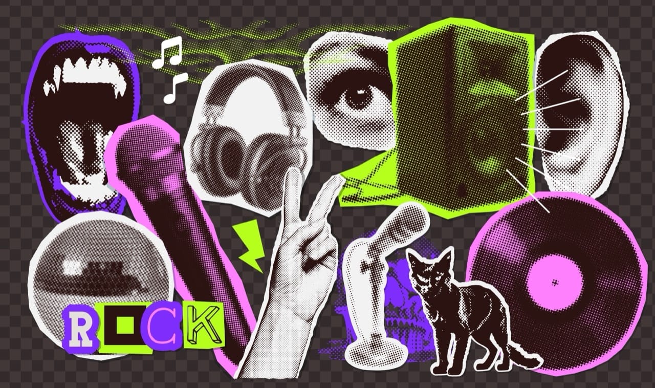
Few styles were as instantly recognizable as black metal’s jagged, thorny logos. The near-unreadable lettering was not an accident or a gimmick; it projected hostility to mainstream legibility and a commitment to underground values. Many bands leaned on high-contrast black and white layouts, rough photocopied textures, and medieval or occult cues. In Norway’s early 90s wave, stark imagery and cold landscapes helped reinforce the idea of isolation and extremity, while references to ancient symbols, runes, and church architecture connected the music to a mythic past. The now-familiar goat head, inverted crosses, and ritual objects became visual triggers that told buyers they were looking at a particular strain of anti-commercial, confrontational metal.
Death metal used a different set of cues. Logos were still complex, but often more organic, like dripping or bone-like lettering suggesting bodily decay. Cover art frequently leaned into grotesque anatomy, horror cinema, and lurid color palettes. In the early to mid 90s, a glance at a cover could hint at whether you were dealing with Floridian brutality, Swedish buzzsaw aggression, or a more technical approach. Sweden’s scene, for example, developed a recognizable look that paired raw, grim photography with a certain kind of gritty design sensibility, matching the music’s chainsaw guitar tone and street-level intensity.
Meanwhile, European power metal and symphonic-leaning acts often signaled their world through clarity and grandeur. Logos were readable and crest-like, album art featured heroic figures, fantasy landscapes, and polished illustration. These choices weren’t merely decorative; they aligned the bands with escapism, melody, and tradition. Even when the music was heavy, the visual presentation suggested uplift and narrative rather than menace.
As the decade progressed, industrial metal and late 90s alternative metal introduced a more modern graphic vocabulary. Clean lines, stenciled type, hazard symbols, barcodes, and clinical layouts echoed themes of technology, surveillance, and dehumanization. A barcode on an album wasn’t just a practical retail mark; it could be deployed as a statement about commodification and identity. Geometric shapes, minimal color schemes, and design elements borrowed from advertising or machinery made the music feel urban and contemporary, contrasting sharply with the forested, candlelit world implied by black metal packaging.
Record labels also helped standardize these codes. Certain imprints became trusted curators, and their visual branding, catalog layouts, and ad styles trained audiences to associate a look with a sound. Before streaming, these cues mattered: you might buy an album because the logo style, illustration approach, or label aesthetic matched what you already loved.
What makes 90s metal iconography so compelling is how efficiently it communicated belonging. A spiky logo could hint at a country’s scene and its values; a goat head could point toward a particular tradition of transgression; a sterile, industrial design could announce a different kind of rebellion rooted in modern anxiety. The decade’s visual language became a second soundtrack, one that played in the mind before the speakers did.